Landlords · Cheltenham Borough Council
Bedroom Colour Ideas in Cheltenham
Regency Cheltenham demands a particular restraint with colour — the town's cream stucco terraces and tall Georgian windows were designed for tonal, historically-accurate schemes rather than modern contrasts.
Bedrooms reward restraint. The best schemes we've delivered use one deep tone, one warm neutral, and a single accent — nothing more. Overly complex bedroom palettes fight the calm you actually want at 11pm.
What the housing stock around here does to the brief
If this is a rental and durability beats fashion
Rental stock wants a scheme that photographs well, hides scuffs, and can be patched in three years without a full repaint. That means a mid-tone durable matt, not a bespoke bold colour you can never match again.
If this is a working building, not a home
Commercial colour has to survive trolleys, chairs and cleaning chemicals. Scuff-resistant finishes in the traffic zones and a softer palette in client-facing areas is the split that actually works.
Where we start when a client asks for a shortlist
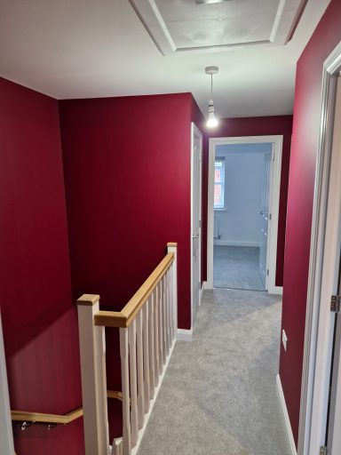
Depth works here. A saturated green or clay tone that would feel heavy in a kitchen reads restful in a bedroom, especially on the wall behind the bed where you never see it while lying down.
Want to see it on your own walls first?
We bring the decks out, paint large cards, and leave them with you for a few days. Plenty of people stop there, and that is genuinely fine.
How we would actually paint it
Two coats of matt or estate emulsion on walls, with woodwork picked out in the same tone one shade lighter. Ceilings in warm white, not brilliant white — brilliant white reads cold under bedside lamps.
Finish. Flat matt walls and a low-sheen eggshell on wardrobes and skirtings. Gloss in a bedroom reflects bedside lamps straight back at you.
In kitchens and bathrooms we move to a moisture-tolerant finish with a mould inhibitor rather than relying on the standard emulsion to cope with steam.
Paint the ceiling in the wall colour diluted 25% with white. It closes the room in visually and creates a cocoon effect that people consistently describe as 'like a boutique hotel'.
De Nimes walls with brass fittings and warm cream linen; Setting Plaster with off-white ceilings and dark oak flooring.
What we would and would not do here
The regret we hear most is a bright accent wall opposite the bed, because it is the first thing you look at every morning.
- •One deep tone, one warm neutral, one accent. Bedrooms that read calm almost always use three colours or fewer.
- •A warm white ceiling rather than brilliant white, because bedside lamps and LED bulbs both read cool.
- •Deeper colour behind the bed, carried up onto the ceiling above the headboard.
- •Matt on walls and water-based eggshell on trim, which stays white instead of yellowing.
- •Brilliant white walls in a bedroom used mainly at night, which look grey under lamplight.
- •Very saturated accent walls, which are the first thing repainted when tastes move on.
- •Cool grey in a north facing bedroom.
- •Feature wallpaper behind the bed with three grey walls.
- •Cool grey and white with high gloss trim.
- •Matching curtain, cushion and wall colour sets.
The room brief before the colour brief
Most colour advice ignores the room itself. Bedrooms are mostly seen at either end of the day, in low warm light or early flat daylight, which is the opposite brief to a living room.
Depth works here. A saturated green or clay tone that would feel heavy in a kitchen reads restful in a bedroom, especially on the wall behind the bed where you never see it while lying down. Get that right and the specific colour name matters far less than people expect.
Rental stock wants a scheme that photographs well, hides scuffs, and can be patched in three years without a full repaint. That means a mid-tone durable matt, not a bespoke bold colour you can never match again.
Montpellier and Lansdown Regency properties reward Farrow & Ball or Little Greene heritage palettes; Charlton Kings 1930s semis take modern schemes well; Prestbury cottages suit deep, saturated colours.
Cheltenham's Cotswold-edge position gives strong afternoon light in west-facing rooms — colours like Cornforth White and Slaked Lime hold their warmth here where they'd read grey elsewhere.
Sample on the wall behind the bed and on the wall you face when you wake up, they will not look the same.
Working with Cheltenham homes on bedroom colour ideas
One of the things we've learned working bedroom painting jobs in Cheltenham: Edwardian bay-window terraces reacts differently to modern paints than newer-build construction does. We adjust our specification accordingly — often using breathable systems where appropriate.
Cheltenham bedroom painting customers typically have one of two starting points: a property near Gloucester Cathedral that's seen better days, or a recent purchase in the GL1, GL2, GL3 area that needs bringing up to standard. Our process handles both equally well.
Where we work near you. Cheltenham is ringed by M5 junctions 10 and 11 with the A40 running east into the Cotswolds. Travel is already priced into the figures above rather than added at the end.
the Severn Vale brings persistent westerly weather and high humidity, while Cotswold edge properties face exposed elevations. For Cheltenham bedroom painting customers that has practical consequences: the timing window for exterior work is tighter than people often assume, and interior rooms on north-facing elevations within the GL52 and GL50 areas are noticeably more prone to condensation. We factor both into the products and additives we recommend during the quote stage.
Work near Cheltenham Promenade tends to involve the older end of the local housing stock. Recurring themes here include magnolia-over-magnolia interiors in 1980s Gloucester estates and the careful prep needed before any topcoat goes near Regency stucco rendered onto brick. We've developed a sequence for these properties that addresses the substrate first — fillers, primers, and stabilisers chosen for the specific construction — rather than relying on the paint itself to compensate for poor preparation.
One pattern we see consistently across GL51 and GL4 is Regency stucco crazing on Cheltenham terraces that needs flexible elastomeric coatings. It's not always obvious from the street, but it shows up almost immediately during a proper survey. Treating it correctly takes longer than ignoring it, but the bedroom painting finish that goes on top will outlast a quick-cover job by years rather than months.
Questions we get asked about this
What's the best colour for a small bedroom?
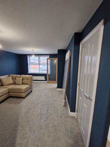
Counterintuitively — a deeper colour. Painting a small room white makes the boundaries obvious. A muted deep tone like De Nimes lets the walls recede.
Should bedroom walls be matt or eggshell?
Matt on walls, eggshell on woodwork. Matt hides plaster imperfections and gives a soft, restful surface.
How much to paint a bedroom?
£350-£650 for a typical double bedroom including walls, ceiling, and woodwork — assuming standard prep and one coat of paint supplied.
Does the direction the room faces really matter?
Bedrooms are mostly seen at either end of the day, in low warm light or early flat daylight, which is the opposite brief to a living room. It changes which undertone works, more than it changes which colour family works.
What do people most often regret?
The regret we hear most is a bright accent wall opposite the bed, because it is the first thing you look at every morning.
Which finish should I use in here?
Flat matt walls and a low-sheen eggshell on wardrobes and skirtings. Gloss in a bedroom reflects bedside lamps straight back at you.
How many samples should I test before deciding?
Two or three, no more. Sample on the wall behind the bed and on the wall you face when you wake up, they will not look the same.
The short version
Depth works here. A saturated green or clay tone that would feel heavy in a kitchen reads restful in a bedroom, especially on the wall behind the bed where you never see it while lying down. Flat matt walls and a low-sheen eggshell on wardrobes and skirtings. Gloss in a bedroom reflects bedside lamps straight back at you.
Not sure between eggshell, satinwood, mineral paint or paper? Bring the brief and we'll suggest finishes that suit the property, the use and your maintenance appetite.
Bedroom Colour Ideas in nearby towns
More Cheltenham colour guides
- Popular Paint Colours in 2026 in Cheltenham
- Living Room Painting Ideas in Cheltenham
- New Build Colour Schemes in Cheltenham
- Small Room Colours That Make a Space Feel Bigger in Cheltenham
Ready to book? See our bedroom painting in Cheltenham page for quotes and typical prices.
Book a free colour consultation in Cheltenham
We'll bring the full deck to your home, sample large cards on the actual walls, and give you a fixed quote — no obligation.