Commercial premises · Oxford City Council
Period Property Colours in Oxford
Oxford's period stock — Jericho's Victorian terraces, Summertown Edwardians, and the Cotswold-stone streets around Iffley — sets a different colour brief to almost anywhere else we work. Heritage tones and breathable paints matter here more than in newer towns.
Georgian, Victorian, and Edwardian houses were designed for specific paint palettes — historic pigments were expensive, so period schemes tend to be tonal rather than contrasting. Getting this right respects the architecture and adds real value at resale.
What makes this room different from every other room
Light is the variable people underestimate: the same tin behaves differently on every aspect and at every time of day. That is the starting point for this whole page.
Start from the things you are not changing, the flooring, the worktop, the sofa, and choose paint around them rather than the other way round. Get that right and the specific colour name matters far less than people expect.
Commercial colour has to survive trolleys, chairs and cleaning chemicals. Scuff-resistant finishes in the traffic zones and a softer palette in client-facing areas is the split that actually works. Two large sample cards, two different walls, judged in daylight and after dark.
Jericho's high-ceilinged terraces reward Farrow & Ball's deeper palette; Summertown's Edwardian semis need warm neutrals to keep character; college-adjacent flats often carry listing restrictions requiring breathable finishes.
Oxford's low, diffuse river-valley light means warm palettes read truer here than in higher, brighter towns — cool greys often disappoint on-site.
Two large sample cards, two different walls, judged in daylight and after dark.
What the housing stock around here does to the brief
If this is a working building, not a home
Commercial colour has to survive trolleys, chairs and cleaning chemicals. Scuff-resistant finishes in the traffic zones and a softer palette in client-facing areas is the split that actually works.
If you live here and have to look at it every day
Owner-occupiers can afford to be braver with colour than landlords, because you are the only person who has to love it. The trade-off is that you also live with the mistakes, so sample properly before committing a whole room.
Not ready for a quote? Have the advice anyway
Send a photo of the room and what is staying in it. We will tell you what we would put on the walls, no obligation attached.
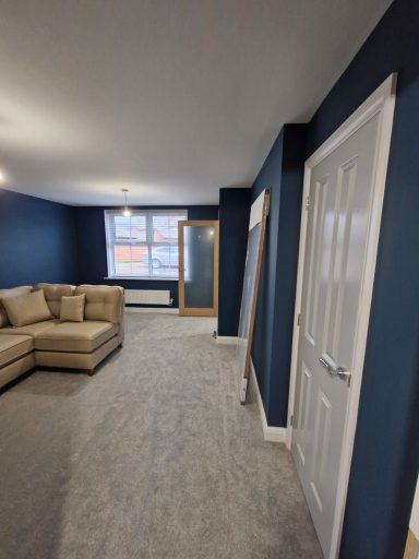
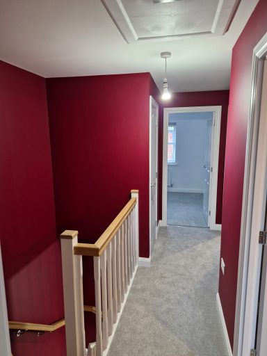
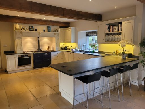
Five colours worth sampling first
Start from the things you are not changing, the flooring, the worktop, the sofa, and choose paint around them rather than the other way round.
Working with Oxford homes on period property colours
Homeowners near the Iffley Road area often ask about new-build snagging touch-ups in Barton Park and Mosaic developments. We handle this regularly — modern eco-build cassette construction responds well to a careful prep sequence followed by the right specification of paint or coating.
From the Iffley Road area out to the surrounding Central Oxfordshire villages, we see a consistent pattern. new-build snagging touch-ups in Barton Park and Mosaic developments is a frequent finding, and we always quote on the basis of fixing the underlying issue rather than painting over it.
Where we work near you. Oxford is ringed by the A34 and A40 with M40 J8 just east. Travel is already priced into the figures above rather than added at the end.
For Oxford period property painting customers asking what's typical for the area: jobs around the Iffley Road area skew towards heritage colour palettes and breathable products, while modern estates within OX2 are often more about contemporary neutrals on plasterboard and MDF. Both are equally valid — they just need different specifications, and we quote each on its own terms.
Specific issues we encounter often in Oxford include Edwardian villa hallway and staircase repaints in North Oxford and Summertown, new-build snagging touch-ups in Barton Park and Mosaic developments, and rental-flat turnaround repaints in Cowley and Headington. Each one has its own correct response, and lumping them together under "preparation" doesn't do justice to how much the right approach extends the life of a period property painting finish. Our quotes itemise this work so you can see exactly what's being done and why.
Local material reality matters: modern eco-build cassette construction dominates parts of Oxford that newer build does not, and the local climate adds its own demands. Oxford's clay subsoil contributes to seasonal movement that opens up hairline cracks in plaster, so flexible fillers and mist coats matter here. Combined, this means our period property painting specifications for properties around the Oxford colleges will often differ noticeably from those a few postcodes away — and rightly so, given how differently those properties behave over a ten-year horizon.
Finish, prep and the practical bits
Historic properties reward tonal woodwork — skirtings and architrave in the same colour as walls, one shade lighter or darker, never brilliant white. Ceilings in a warm off-white, panelling picked out in a deeper shade of the wall colour.
Finish. Match the sheen to the traffic: flat matt where nothing touches, washable matt or eggshell where things do.
Where a wall has been patched, we mist-coat the repairs before the finish coats, otherwise the patches flash through as dull spots in the final colour.
Match the picture rail colour to the wall colour above the rail (usually a lighter neutral), not the wall below. It preserves the proportions of the room the way the architect intended.
Book Room Red dining room with Setting Plaster hallway; Hague Blue study with Sudbury Yellow adjoining reception room.
Common questions before people commit
What paint should I use in a listed building?
For listed interiors we spec Little Greene Traditional Distemper or Farrow & Ball Estate Emulsion — both are breathable and appropriate for lime plaster.
Can I use modern colours in a period property?
Yes, but tonally. Modern greys often read cold in period rooms — swap to a warmer near-neutral like Elephant's Breath or Skimming Stone and the room comes alive.
Do I need lime paint for old walls?
Only if the walls are still lime-plastered and unpainted with modern emulsion. If they've been emulsioned in the past 40 years, modern breathable emulsion is fine.
Should the woodwork match the walls?
In this room, it depends on whether you want the architecture to stand forward or recede; matching plays it down, contrasting picks it out.
Does the direction the room faces really matter?
Light is the variable people underestimate: the same tin behaves differently on every aspect and at every time of day. It changes which undertone works, more than it changes which colour family works.
What do people most often regret?
Picking from a printed chart under shop lighting is the root cause of most of the colour regrets we are asked to fix.
Which finish should I use in here?
Match the sheen to the traffic: flat matt where nothing touches, washable matt or eggshell where things do.
If you only remember one thing
Picking from a printed chart under shop lighting is the root cause of most of the colour regrets we are asked to fix. Two large sample cards, two different walls, judged in daylight and after dark.
46+ verified Checkatrade reviews at 10/10, dustless sanding kit, premium trade paints, fully insured at height. The bit customers comment on most: the prep we do before any paint goes on.
Period Property Colours in nearby towns
More Oxford colour guides
- Bedroom Colour Ideas in Oxford
- Kitchen Colour Ideas in Oxford
- Farrow & Ball Colours in Oxford
- Kitchen Cabinet Colours in Oxford
Ready to book? See our period property painting in Oxford page for quotes and typical prices.
Book a free colour consultation in Oxford
We'll bring the full deck to your home, sample large cards on the actual walls, and give you a fixed quote — no obligation.